listentofeist.com
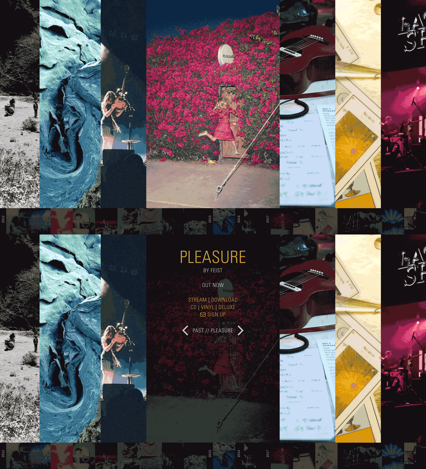
I had the opportunity to design Leslie Feist's new website. She was looking for something a little different in terms of design and structure. The goal of the site is to cover the span of her career through images, sound and video clips. It is an exploratory experience with no particular user-flow. The site goes beyond professional media images by incorporating sketches, polaroids, works-in-progress and other rarely seen pieces of her creative process and her life on the road with her bandmates and collaborators.
The site functions as a two-level time line. The larger vertical images at the top are slices of her career moments, that open up into larger galleries for that career highlight. The smaller timeline at the bottom is the same set of slices, but smaller to allow for more moments to be visible at once. It is also constantly visible whether you are in the big timeline or in a gallery, providing a means of navigation.
Leslie Feist | Freelance Project | 2016-2017 | Web Design
Built by Mark Bennet
Experience the full site here:

Large and Small Timeline
Both timelines are side scrolling

Large and Small Timeline
Another spot on the large side scrolling timeline, and the hover-state on the smaller timeline.

Example of a Gallery Page
Once a slice is selected on the timeline, it opens to a gallery with all the media associated with the event. This one in particular shows the release of Feist's animal "Metals"

